Pages

April 26, 2015

Kano Co-Founder To Talk Building A Coding Kit Business At Disrupt NY

Sales pitches for products that aim to teach a new generation to learn to code arrive thick and fast in the inbox, these days. But one of the most polished entrants in this burgeoning space remains U.K. startup Kano, which Kickstarted its startup coding kit business at the end of 2013 — raising around $1.5 million from geeky parents to get the ball rolling.

On Monday May 4 at 10.45am, in just under two weeks’ time, Kano co-founder Alex Klein will join us on stage at Disrupt NY to discuss the challenges of building a startup that involves so many pieces — literally pieces of hardware, software and even paper-based media (including, yes, actual physical stickers) are involved — so we’ll be asking about the supply chain, team and management logistics that keep all that from coming unstuck.

Kano leverages the Raspberry Pi microcomputer as a hardware base on which to build — constructing a coding kit that extends beyond fun, colorful plug-and-play electronics into a gamified, child-friendly Linux-based learning software environment where kids are encouraged to learn and share programming skills. The whole kit and kaboodle if you will.

Plus Kano’s primary hardware component, the Pi, recently got a big upgrade so we’re curious to see how the team is responding to the Pi Foundation’s own product evolution.

Meanwhile Kano has its own platform — the Kano OS software stack that runs on the Pi hardware —  which it needs must flesh out into a rich ecosystem populated with third-party apps if it’s going to keep users engaged over the longer term. More challenges there. And more questions.

Delivering a crowdfunded hardware product without significant delays is no mean feat either. Klein will likely have some tips to share and be able to talk about post-Kickstarter strategies for keeping momentum going. After all the wider goal is turning a nascent first-gen product into a self-sustaining business. So what happens after that comfy crowdfunding cushion has been spent?

TC Disrupt NY runs May 4-6 at the historic Manhattan Center. Tickets are still available.

post from sitemap

Blink, Offering Vision Tests On-Demand, Launches In New York

Anyone who has transitioned from blurry vision to the perfect pair of corrective lenses or glasses knows just what a blessing clear vision is. But going to get your vision tested can be time-consuming and annoying. And to make matters worse, optometrists spend about an hour per patient doing routine steps to collect information for a vision test when they could be helping patients with actual health issues.

Blink, a company formed out of the MIT Media Lab, is looking to change all that.

The company started with a 3D-printed smartphone add-on for measuring eyes for glasses, but the product has since evolved to provide all the service and equipment necessary to offer a full vision test, on demand.

Through the app and various pieces of equipment (all of which can fit into a tiny suitcase), Blink offers users the option to order a vision test direct to their home. According to the founders, the Blink option acts as a mobile substitute for $20,000 worth of immobile equipment used in an optometrist’s office.

A visioneer (as they call it) visits the house, sets up a little eye chart on a wall, and starts asking a few basic questions about your current prescription, how often you wear glasses or contacts, and if you have any history of health problems with your eyes. Then, with the help of a tablet app and a view-finder device, the user takes a series of easy tests that measure vision.

The device is called the Netra, and aside from the smartphone used as a display, the whole thing is mechanical so that it doesn’t ever run out of battery. It is highly reminiscent of the Samsung Gear VR, but instead of virtual reality games, the software is all about testing your vision. The visioneer then pairs the information garnered from the tests with data gathered from the user’s ability to read the eye chart.

From there, the visioneer moves on to a new device called the Netropter, which lets you try out the suggested prescription by reading the eye chart again, replacing the painful process of deciding between “one or two, two or three, one or three?” as you would at the eye doctor’s office.

Blink is very clear about the fact that this is not a substitution for an optometrist visit, but rather an easier way to get a glasses prescription.

“It’s a vision test,” said founder David Schafran. “It’s not a check-up.”

From there, Blink sends all the gathered information from the test to optometrists that the company has partnered with, who then spend about ten minutes analyzing the data and writing out a prescription. The prescription is then sent to the user via email and can be used to buy a new pair of glasses — the company is working on a solution to measure for contact lens prescriptions.

For every vision test Blink performs, the company gives a vision test and a free pair of glasses to someone who is in need locally.

It costs $75 to do a vision test, but if you get a few friends or co-workers together, the price per person goes down based on the number of tests a Visioneer gives in a single visit.

post from sitemap

Moscase Is Like Batman’s Utility Belt For Your iPhone

The average phone case is basically a piece of plastic that protects your device when you drop it. But what if you could add modular features to your iPhone like a heart rate monitor, a grappling hook, or a backup battery? Now you can.

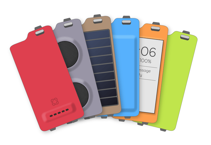
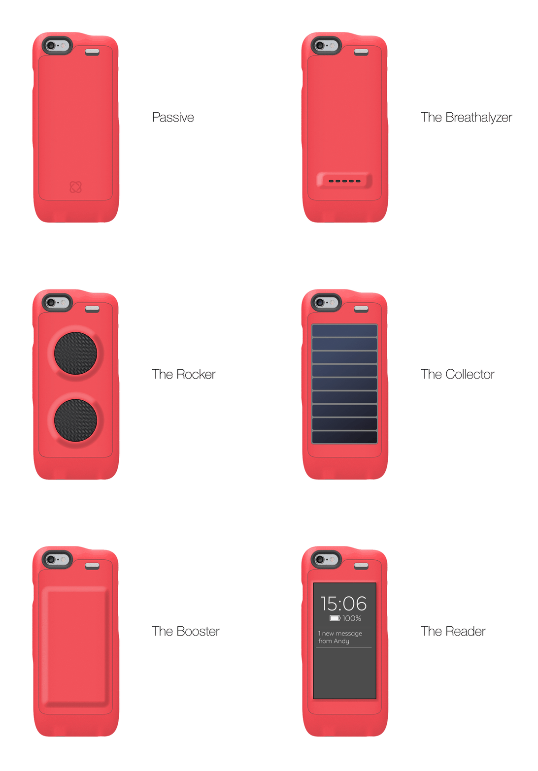
Moscase comes to use from Hungary and is being crowdfunded to the tune of $150,000. The case protects your iPhone 6 or 6 Plus and has a removable back. You can quickly snap out the back and replace it with one of the optional tools, turning your case into a breathalyzer, a speaker, or even an e-ink screen for reading.

The device comes in two parts. The bumper without a backplate can sense your pulse, temperature, and body impedance AKA how fat you are. It costs $129 and comes with a “passive” backplate. A model with one “active” backplate costs $219. I think the e-ink solution is the coolest, allowing you to read on the back of your phone, saving your battery for more important work.

6cd5bf08e1327a76146845daabc759fe_original

Obviously all this is pretty pricey but it’s a cool way to add lots of sensors to your iPhone for not much money. I met one of the founders in Budapest and he told me that they found traction at home but not abroad and, when they ship in June, you’ll have plenty of time to play with your new case before Apple releases the iPhone 7 with USB-C and a huge rear camera.

post from sitemap

iFixit Apple Watch Teardown Suggests No Internal Chip Upgrades

Today is Apple Watch D-Day for a speedy few early adopters, with Cupertino finally shipping the first batch of its debut wearable to buyers.  That means it’s also the day that serial repairers/tenacious teardowners iFixit get to crack open Apple’s latest sealed box and peer inside so we don’t have to.

Their teardown of a 38mm Apple Watch Sport and a 42mm Apple Watch steel are currently in progress — you can follow the painfully detailed dissection here.

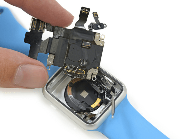
One nugget of intel they’ve managed to prise out of the back of the dinky wrist computer so far is that Apple is not making it easy to swap out the S1 processor chip that powers the watch.

That may sound pretty obvious but there have been suggestions Apple could offer an upgrade program for the Watch — offering processor upgrades as a way for the smartwatch to stand the test of time vs less smart (but more long-lived) luxury watches with which it competes for wrist real-estate.

However iFixit’s findings suggest those rumors are wide of the mark (albeit, this finding relates specifically to the lowest priced Apple Watch Sport model).

Screen Shot 2015-04-24 at 9.51.42 AM

Getting to the Watch’s S1 processor took iFixit 20 steps. And required some “destructive procedure”, as they term it — aka ripping out soldering. “Despite rumors (and hopes) of an upgradable product — the difficulty of removing the S1 alone casts serious doubt on the idea of simply swapping out the internals,” they note.

The Apple Watch’s S1 chip is also encased in what they describe as “a solid block of plasticky resin” — presumably to make curious teardowners like iFixit work harder for component intel.

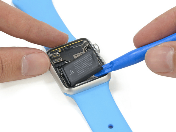
In contrast to its silence on the sealed away S1, Apple has previously confirmed to TechCrunch that the Apple Watch’s battery will be replaceable. And iFixit’s teardown bears that out — showing it’s far simpler (and non-destructive) to get to the battery to replace it.

After lifting and disconnecting the display to get to the guts, they’re able to flick the battery out — by step 11 in their teardown — liberating it from what they say is only “light adhesive” securing it in place.

iFixit Apple Watch teardown

TechCrunch understands the lifecycle of the Apple Watch battery is pegged at around three years. But if there’s no avenue for swapping out and upgrading the internals at the same time, users may well be pushed towards a wholesale device upgrade in order to get the next-gen processor.

post from sitemap

See The Specs Restyled By 3D Printing

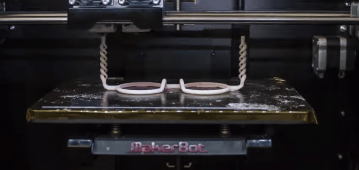
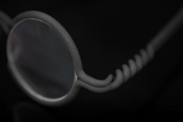
The 3D printed future is looking increasingly cartoonish if this crowdfunder for one-piece flexible nylon eyewear is making a prescient design call. Called Mono, the designer specs look like they’ve been scribbled onto the model’s face with a Sharpie marker.

Hong Kong based architect Edmond Wong came up with the idea for a single piece pair of specs that are printed in one go after having trouble of his own finding glasses that fit. He says he had existing experience using 3D printers for making architectural models so put the two together and came up with designs for a range of 3D printed one-piece specs — bringing an optician friend on board for relevant experience.

Mono

The Mono design allows online buyers to be reasonably confident of a good fit across the range of styles and without trying the glasses on in person because the designs are sized across three points on each pair of glasses, each of which can be one of three different size measurements. So the buyer specifies S, M or L for the frame width, the nose pad, and the length of temples respectively.

There are exact millimeter measures for all those sizing specifications, with the medium size being an average, and small and large aiming to cover the “extreme cases”. Mono’s coiled hinge design (also necessary for the glasses to be printable as one piece) and the flexible nylon material used for the frames are also intended to help achieve a better fit.

Mono

Wong says the nylon (fine Polyamaide PA 2000 to give it its technical name) is strong and durable, and able to stand up to UV exposure — as you’d hope, given their exposed-to-the-elements situation

But how do the flexible, one-piece specs stay on the wearer’s face? The end of the temples bend inwards and downwards slightly so are designed to hug the wearer’s head, according to Wong. The lenses are held in place within the 3D printed nylon frames via grooves, as with conventional glasses. But Mono is making much of the ability to pop out your lenses on demand to switch between standard glasses and tinted and shaded lens as required — i.e. unlike conventional glasses.

Mono

Wong says Mono has been around 10 months in development up to this point. It’s been self-funded by him up to now, although he notes that desktop 3D printer prototyping allow for significantly reduced product dev costs and lower risk on such wackily creative gambles.

The duo is now looking to raise around $30,000 via Indiegogo to cover some less incremental manufacturing costs, such as minimum lens and accessories orders, as well as for other areas such as patent applications for their flexible, single-piece hinge design.

Early crowdfunder backers can pledge for a pair of Mono optical glasses for $99, or $199 for sunglasses — due to ship by August. A combo lens bundle which consists of the frames plus a pair of optical and a pair of tinted lenses costs $135.

Whether wearing 3D-printed cartoon specs will make you look stylish or silly is another matter. But additive manufacturing is going to encourage more custom styling to creep into convention — so expect more playful and/or bespoke design to be a future standard.

post from sitemap

Why You’ll Hate the Apple Watch And The Important Business Lesson You Need To Learn

Editor’s Note: Nir Eyal is the author of Hooked: How to Build Habit-Forming Products and blogs about the psychology of products at NirAndFar.com.

If you are among the 19 million people Apple predicts will buy an Apple Watch, I have some bad news for you — I’m betting there is an important feature missing from the watch that’s going to drive you nuts.

That doesn’t mean you shouldn’t buy one. In fact, I’m ordering one myself. However, this paradox illustrates an important lesson for the way companies design their products.

Rarely are v.1 products very good. How is it, then, that some products thrive despite flagrant shortcomings?

Meet Mr. Kano

To find out why youll likely be disappointed by the Apple Watch, meet Professor Noriaki Kano. In the 1980s Professor Kano developed a model to explain a theory of customer satisfaction.

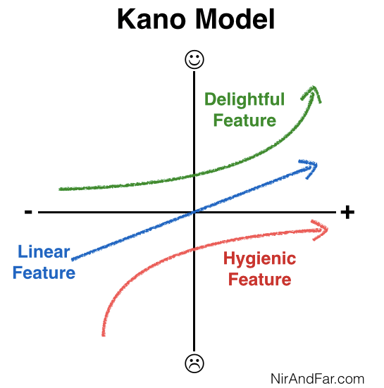
Kano believes products have particular attributes, which are directly responsible for users’ happiness. He discovered that some qualities matter more than others. Kano describes three product attribute types (loosely translated from Japanese as): delightful, linear and hygienic features.
Kano

A delightful feature is an attribute of a product that customers love but do not expect. For example, if the Apple Watch made you coffee every morning, that would be a delightfully surprising feature.

A linear feature, on the other hand, is one users expect. More of that quality increases satisfaction. Battery life is an example of a linear feature of the Apple Watch. You trust that it will last all day but the more juice the battery has, the less you need to charge it and the happier you are. Customers are typically able to articulate the linear attributes of a product (“I want it to have long battery life”) whereas by definition they can’t tell they want a delightful feature until they’ve seen it in action. Like knowing the punchline of a joke: If you know what to expect it fails to delight.

Finally, hygienic or “basic” features are must-haves. Customers not only expect these attributes, but they depend on them. If the Apple Watch is bad at telling time, for example, you would undoubtedly be very ticked (tocked) off.

Ellen DeGeneres tweeted a sardonic comment that perfectly demonstrates what happens when we make a basic feature sound like a delighter.

Joking aside, Apple CEO Tim Cook knows just how important telling time is for an expensive timepiece. Cook emphasizes that the device is accurate within 50 milliseconds. In addition, when the battery is almost depleted, the watch kicks into “Power Reserve” mode, shutting down everything but the ability to see the time.

Obviously, Apple understands telling time is a hygienic feature. However, when it comes to this basic feature, something is still missing. This brings me to what will likely annoy you about the Apple Watch.

Inconspicuous Consumption

A basic attribute of any watch is that it allows wearers to see the time all the time. With a regular watch, checking the time couldn’t be easier. You only need to  glance down to know what time it is — not so with the Apple Watch.

To save battery life, the watch goes dark when it thinks you’re not using it. To turn it back on, you have to shake the device with enough momentum to, in Apple’s words, “Activate on Wrist Raise.”

if telling the time on your Apple Watch requires a spastic wrist jolt, you’ll curse it.

Early Apple Watch reviewer John Gruber wrote about his experience wearing the device during the end of a meeting with a friend. “It got to 3:00 or so, and I started glancing at my watch every few minutes. But it was always off … the only way I could check the time was to artificially flick my wrist or to use my right hand to tap the screen — in either case, a far heavier gesture than the mere glance I’d have needed with my regular watch.”

Who hasn’t sat across from an overly gabby colleague wondering whether youll be late to your next meeting? If we’ve bothered to wear a watch, we expect to be able to see the time at a glance. But if telling the time on your Apple Watch requires a spastic wrist jolt, youll curse it.

Gruber continued: “… for regular watch wearers, it’s going to take some getting used to, and it’s always going to be a bit of an inconvenience compared to an always-glance-able watch. It’s a fundamental conflict: a regular watch never turns off, but a display like Apple Watch’s cannot always stay on.”

The problem is significant enough that other smartwatch makers already see Apple’s failing as an opportunity. The recently announced Pebble Time, for example, uses a low-power color e-paper display and never goes dark.

Youll Still Buy It

Of course, all this doesn’t mean you’re not going to buy the watch. Apple may very well make the wake feature so sensitive that few people are troubled by it. After all, even an obvious wrist shake is better than the inconvenience of checking the time by taking out your phone. However, greater turn-on sensitivity will come at the expense of battery life, a compromise consumers aren’t going to be happy about. To avoid disappointment, keep your expectations low and be prepared to miss some basic features you’d expect from even a cheap watch.

Remember, the iPhone had its problems in the beginning. Apple’s choice of AT&T as the exclusive service provider for the first few generations of the iPhone meant more dropped calls and poor reception. The device was often loathed for its inability to deliver the basic Kano feature customers expected most from a phone — namely, to complete a call.

Over time, the technology improved, but why did people put up with these seemingly fatal flaws for so long? Here again, the Kano model helps us better understand the mindset of consumers.

People kept using (and often praising) the iPhone because the delight factor made up for its lack of basic attributes. Mainly, Apple‘s App Store and its near infinite variety of nifty solutions provide a constant stream of delightful features even Steve Jobs could never have imagined.

The iPhone still doesn’t make coffee, but it does so many other surprising things you didn’t know it could do when you bought it (from checking your heart beat to identifying constellations) that you overlook its flaws.

To avoid disappointment, keep your expectations low.

As for the Apple Watch, over time Apple will no doubt fix quirks in the first generation just as it did in subsequent iPhone editions. Ultimately, better battery life or alternative screens will keep future versions lit throughout the day. But the real delighter behind the Apple Watch, like the iPhone, will be the apps. Cook recently sent an email to Apple employees announcing that more than 1,000 apps have already been submitted.

Expect future generations of the Apple Watch to have more delightful features customers currently don’t expect. My money on the Apple Watch 2 including a forward-facing camera, which wearers will discover makes taking pictures even easier and faster than using their phones. And it adds an element of delight every time they take a surprisingly good shot.

We have a love-hate relationship with technology, and the Apple Watch will be no exception. By applying Kano’s model, companies can overcome the unavoidable deficiencies that come with new products by building-in features that continue to surprise and impress.

post from sitemap

An Early Look At The Apple Watch App Ecosystem

With the Apple Watch now officially on the market, and soon to be on the wrists of several million customers – possibly as many as 20 million this year, according to some estimates – there’s a lot of curiosity about what kind of app ecosystem will spring up around the new device. Will Apple Watch owners actually be interested in reading news, shopping or playing tiny games, or will the Watch serve its customers better when it fades into the background, allowing you to pay at checkout, unlock hotel room doors, and only alerting you when it has something really important to share?

While it’s too soon to say how consumers will embrace this new platform, we do have some early insights into how developers have approached the Apple Watch, according to new data from app store analytics firm App Annie.

Apple yesterday said that the Apple Watch was launching with over 3,000 applications that work on the device, but App Annie has pegged that number more exactly to be 3,061 as of yesterday’s count – which the firm notes is a “healthy start” for the new wearable.

Also interesting is that a significant portion of apps have been designed exclusively for the Apple Watch.

The majority of Watch apps are the result of developers who extended their existing iOS applications to include Watch support, of course, but App Annie tracked 889 apps – or 29% of the total sample – built just for the Watch. The company said it was able to infer this from the fact that the first version of the app was developed in the last two weeks, which is a fairly reliable means to determining which apps were designed with the new smartwatch in mind.

Some developers are hoping that including support for the new Watch will also help them be better discovered in App Store searches as well, as new device owners seek out apps that can translate to their wrist. 10% of the Watch apps live now (or 311 apps), currently include the word “Watch” in their app’s name in order to help consumers through the sorting process, App Annie found.

As to what sort of apps developers are building, it’s not entirely surprising to find the community gravitating toward the kind of apps that help users get things accomplished. After all, the Watch is often thought of as a functional, enabling technology rather than a distraction, the way smartphones have become. The leading category with the most Apple Watch apps is the “Utility” category, App Annie says, with 12% (373 total) apps.

What is perhaps more interesting is that many developers are betting that users will eventually began to goof off with their fancy wrist-wear: Games comprise 10% of the total App Watch apps built to date.

Following Games are Productivity apps (8%), Lifestyle apps (7%), then Health & Fitness apps (also 7%). Those top five categories out of the 22 total categories live at launch represent a combined 46% of all Apple’s Watch apps. For comparison’s sake, Catalogs and Books have less than 20 apps. Clearly developers don’t believe these sorts of apps make sense on the small screen. (I’d have to agree.) Meanwhile, Weather, Photo & Video, and Medical apps are also on the lower end at 2% and under.

The Medical category would have some overlap with Health & Fitness apps – so if you combined the two categories, it would indicate a larger preference among the developer community to focus on the health aspects to Apple’s new wearable device.

The real question now is what apps will users actually download from these categories, once their Apple Watch arrives? And how many of those apps will be deleted after the initial buzz of trying new app experiences wears off? That’s data App Annie is also collecting, and will release in the days and months ahead.

post from sitemap

April 10, 2015

Countertop Is A Connected Kitchen Gizmo To Simplify Balanced Meal-Making

Meet Countertop: the latest connected kitchen gizmo from Google Ventures-backed Orange Chef which reckons it has found the perfect blend of smart and dumb kitchenware to help consumers prepare healthier meals and quantify the nutritional balance of what they eat.

Countertop is going up for pre-order today, costing $99.95, which is half the planned full retail price, with a shipping date of fall 2015. It’s U.S. only for now.

The device consists of a smart board that can weigh and track ingredients plus an app that recommends recipes, dispenses step by step meal making instructions and tracks nutritional intake, such as calories.

The bigger twist is that the board is also able to recognize some of your existing kitchenware, such as blenders and crock pots, when you retrofit them with dedicated Countertop adaptors.

It can also integrate with fitness wearables, such as Jawbone’s UP, and with Apple’s Health data repository in order to factor in personal activity and sleep cycle data to its meal recommendations — with the pitch being that enables Countertop to offer tailored nutrition suggestions customized to the individual user.

“Countertop suggests personalized, easy-to-make meals or snacks that are healthy and tailored to your palate and nutritional goals,” says Orange Chef CEO Santiago Merea. “We’re not trying to encourage folks to make a culinary masterpiece — in fact, most of our meals generally include five or less ingredients. We walk each user through the process of adding, prepping, and cooking their meal, and along the way we hope our users learn more about what kind of nutrition they are getting.”

The company behind Countertop, Orange Chef, started back in 2011, when it was called Chef Sleeve, selling simple plastic sleeves to protect iPads being used in the kitchen. It’s steadily expanded its culinary-focused product portfolio, pushing into connected kitchen devices in 2013 — with a smart Bluetooth kitchen scales (plus app) called Prep Pad that also focused on helping people eat healthier.

Countertop continues the startup’s expansive trajectory by looping in existing kitchen devices via dishwasher-proof, heat-resistant NFC stickers (the aforementioned adaptors). So while there is some overlap with Prep Pad, the forthcoming gizmo can tap into more of your kitchen gadgetry.

“When the user places an appliance on Countertop, the app now understands the context of what the user is trying to accomplish in the physical world and can give recommendations based on this,” explains Merea. “Furthermore, it helps our base understand when the appliance is being used during Make Mode (dumping ingredients step by step without pre-measuring) and scales the recipe accordingly according to the model, capacity, etc.”

Orange Chef has partnered with Vitamix blenders (which is also a seed investor) and Crock-Pot slow cookers to push the system, with dedicated NFC adaptors ($9.95 and $4.95 for those devices respectively, during the pre-order period).

It says it plans to expand the system further, with Merea noting it is talking to “several large, beloved kitchen brand mainstays about ways of integrating their product lines with Countertop”.

Despite the fresh focus on partners, Countertop does not require other gadgets to work. But partnering with existing kitchen brands is evidently its preferred route to grow its own business.

“You don’t even need add-on adapters or other kitchen gadgets for it to work. We made a bet that users will want to use Countertop with their Vitamix and Crock-Pot because these are two broadly adored products with communities of actively engaged users,” adds Merea.

Orange Chef has raised $4.8 million in seed funding from investors including Google Ventures, New Enterprise Associates (NEA), Lerer Ventures, Forerunner Ventures, Vitamix and individual angel investors including Warby Parker co-founder and co-Chief Executive Dave Gilboa.

It’s not currently breaking out sales of its existing devices, such as its Bluetooth kitchen scales, with Merea merely dubbing them as “significant”.

At this nascent stage in the Internet of Things startups are having to come up with workarounds to blend their own connected devices with existing dumbware to massage their usefulness — such as Countertop’s NFS adaptors. How robust and usable these bridging techs are remains to be seen.

The grand vision for the connected kitchen of the future is, presumably, a smart refrigerator which automatically orders the fresh ingredients required to prep your next set of nutritionally-optimized meals. But we’re a ways off that fully automated health-quantifying, grocery-delivering future. And so enter more NFC stickers.

post from sitemap

Amazon Instant Video Finally Comes To Android Tablets

amazon

Amazon Instant Video is a surprisingly solid Netflix-competitor — particularly if you’re already an Amazon Prime member, which makes much of the content free.

Until today, though, the service had one glaring fault: If you wanted to watch it on an Android tablet that wasn’t Amazon’s Fire HD, you were pretty much out of luck. That fault is finally fixed.

Amazon released a new app this morning that brings the Instant Video service to the countless Android tablets of the world that aren’t Amazon branded.

One caveat: just like when they opened the service up to Android phones, the process for getting the Instant Video app on your tablet is a bit convoluted. Amazon wants you going through its Appstore instead of Google Play. If it’s not already set up on your device, it’ll require some mucking around in settings to get it working.

How to install it:

  • On your device, check the option that allows downloads from “Unknown sources.” It’s usually under Settings > Security.
  • Go to this URL: http://www.amazon.com/getappstore
  • Install the Amazon Appstore
  • Open the Amazon Appstore, find the page for the Prime Instant Video app. Install it.

Note: when you’re not using the Amazon Appstore, you should consider disabling that “Allow Unknown sources” option. Tapping around blindly with that option checked is a pretty easy way to find malware installed on your device.

This process isn’t too bad, but it’s not nearly as pretty as “Open Google Play, install app”. And the users certainly don’t seem to like it much: This method led the existing Instant Video app for phones to rack up over 4,000 one-star reviews.

But hey, Instant Video works on your tablet now!

post from sitemap

Hands On With Microsoft’s Surface 3

Microsoft is back at the well with a new Surface device, the Surface 3. If you’re familiar with the Surface Pro 3, which was released last year, you understand the Surface 3: It’s like the Pro 3 but smaller and less expensive.

The new Surface will cost you $499 at base, a sharp discount from the lowest-tier Surface Pro 3 which tips the scale at $799. Microsoft hopes that it can drive new unit volume with the Surface 3, a bet that presumes that consumers have similar tastes in form factors.

O92A5527

Related Articles

Microsoft Announces Surface 3, A Cheaper, Thinner, Slower Surface Pro 3 Microsoft Is Saying Exactly "Nothing" About The Surface Pro 4

It’s worth remembering that until the Surface Pro 3, that was an open question on the corporate side of things; the Surface 3 will press the same question to a wider audience.

I sat down with the Surface 3 and its predecessors to get a better feel for the new device. Can it help Microsoft’s hardware dreams come true? Hit play and let’s get started.

post from sitemap

The Best Surface 3 Easter Egg

Today is Surface 3 review day for hardware kids — video incoming, I promise — meaning that the media is mostly getting its first full day  with the new Microsoft tablet hybrid. The device is much as we expected it to be, a less expensive Surface Pro 3 in a smaller package.

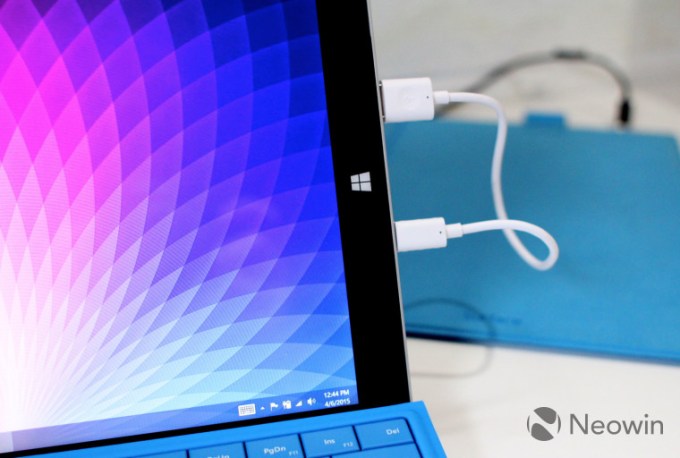
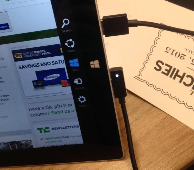
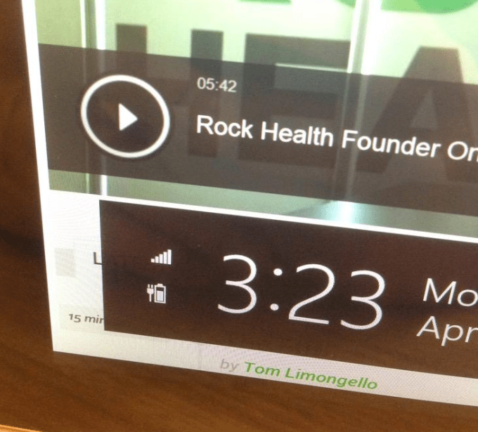
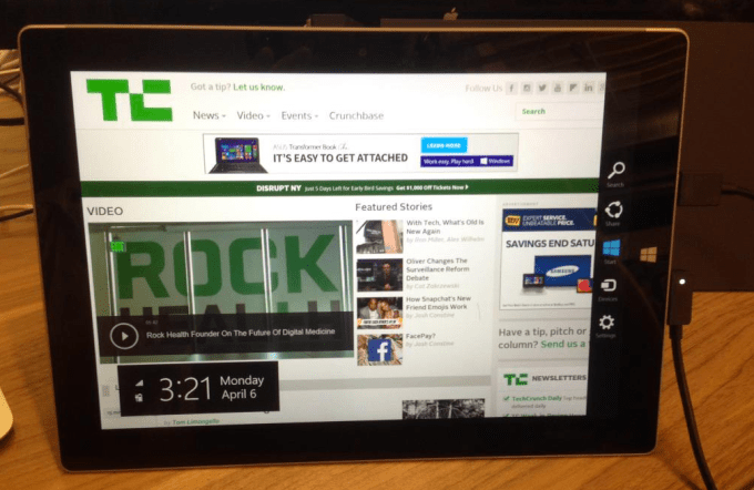
Most importantly, however, is the simple fact that you don’t have to charge the Surface 3. Ever. As Brad Sams of Neowin noted earlier today, if you plug your Surface 3 into itself, it claims to charge for some time. Here’s Sams:

screen_shot_2015-04-06_at_4.24.56_pm_story

This, of course, had to be tested, so here by the grace of God went TechCrunch:

Screen Shot 2015-04-06 at 3.24.49 PM

Screen Shot 2015-04-06 at 3.24.38 PM

Screen Shot 2015-04-06 at 3.24.22 PM

I have to admit, that is some damn fine engineering. Breaking the laws of physics is no mean feat. Jokes aside, this is what comes of adding USB charging to devices. Onward.

post from sitemap

Onion Omega Brings Web Smarts To IoT Hardware Hacking

The Raspberry Pi made experimenting with computing hardware and software more accessible to millions, and now a new project wants to take that concept further with an even smaller developer board that runs full Linux and has built-in Wi-Fi, all on a circuit board just 1/4 of the size of the Raspberry Pi.

The Onion Omega is a dev platform designed to give software developers an easy way to create Internet of Things applications without having to build their own hardware from the ground up, or modify other products to suit their own needs. The Onion Omega is designed to be easy to add to existing hardware projects, providing them with Wi-Fi capabilities, as wells a Linux-based OS, 16MB of local storage, and 64MB of DDR2 400MHz RAM, as well as pins supporting USB 2.0 and 100Mbps Ethernet.

Onion Omega’s creators, which include core team members located in Boston, Toronto and Shenzhen, were looking for a way to build IoT devices easily without having to learn programming beyond their core experience of web dev languages, with easy expansion capabilities and built-in cloud features. Onion Omega ships with a number of expansion module options, and it also offers free access to REST APIs and a number of other connected services out of the box. There’s even an ‘app store’ of sorts offering up easy ways to reprogram the board for use with different types of hardware.

cf00e3fa977742a1f033ef37a9d9648b_original

Already, there are a number of live examples of projects made using the Onion Omega, including this Ping Pong blaster that anyone can queue up to aim and fire using the company’s web-based interface.

Clearly, people are interested in what Onion Omega aims to accomplish: The project has already garnered around $55,000 in backing on Kickstarter, nearly four times the $15,000 it set as its original goal. If you’re looking to pre-order, you can pledge $25 to get both the Omega and the Dock, and for only $10 more you’ll get an expansion module of your choosing, too. The target ship date is August 2015 for the first Omega units going out to backers.

post from sitemap

Sports Broadcast Wearable FirstV1sion Gets Sweat-Tested In EuroLeague Basketball

Smart garments are one of the fitness wearables Gartner recently pegged as having the “greatest potential for growth”. And lining up in that category is Spanish startup FirstV1sion, whose on-body sports wearable will be used during a broadcast of a Euroleague basketball match on Friday to deliver a first-hand player perspective of one of the teams to watching fans.

FirstV1sion’s wearable tech was piloted in February in a Real Madrid vs Barcelona game, with the smart shirts worn by referees. But this is the first time the tech has been worn by players in a live match. The Lithuanian team Žalgiris Kaunas will wear the shirts in their match against Real Madrid, which will be broadcast by 12 channels globally, including Canal+ in Spain.

FirstV1sion’s smart garment contains an embedded HD camera and microphone, sited on the chest, plus additional sensors — including a heart rate monitor and accelerometers — so it can broadcast first person views and also track the wearer’s velocity and biometric data. Of course it’s not the first first-person perspective camera system in sports broadcasting, by a long chalk — hence FirstV1sion also injecting sensor data in a bid to stand out.

The company argues the latter offers safety advantages for players, since their heart rate can be monitored in real-time. But the main play here is entertainment: allowing sports footage to be augmented with individuals’ biometric data and broadcasts to put players’ real-time heart rates on display. In short: Quantified player effort served up to feed sports fans’ emotions. (Although Friday’s EuroLeague basketball match will only include visuals from the FirstV1sion cameras; no audio or biometric data will be broadcast this time.)

FirstV1sion is a graduate of Wayra’s Barcelona accelerator. Spanish telco Telefónica, which runs the program, has invested €60,000/$65,000 in the startup for a 7% equity stake. Other investors include FC Barcelona/Spanish footballer Andres Iniesta, and Serge Ibaka, NBA basketball player for Oklahoma City Thunder.

The startup is also currently running an equity crowdfunding campaign, on Bank To The Future, to swell its investor base with sports fans keen to get even more up close and personal with their favorite teams. It’s aiming to raise at least €2.5M in crowdfinancing from 5,000+ investors.

post from sitemap

The MiTagg NuDock Is A Slick Way To Charge Your iPhone And Apple Watch Together

NuDock Power Station iPhone Apple Watch

One of the chief concerns people have about the imminent Apple Watch is that it’s another device they have to charge every day. While we’ve gotten used to plugging in our phones, tablets and laptops when they need topping off, the addition of one more gadget is apparently a bridge too far.

Of course, one way to reduce the hassle of having that extra device to deal with as you get your gadgets ready for the next day is to make charging all of them a single process.

Some people do this by creating a designated charger space in their home — a kitchen counter, a desk that isn’t used for work very often — and bringing all of their gadgets to that spot to charge at the end of the day. That’s basically my plan for the Apple Watch (which I’m getting to test all of the awesome apps coming from developers over the months to come). I’ll plug in my phone and Apple Watch to the same outlet at the end of the night, right next to my bed since I use my phone as an alarm.

Instead of leaving two wires dangling freely next to my pillow, I’ve decided I’m going to upgrade my spot with a dedicated charger dock that’s currently up for pre-order on Indiegogo.

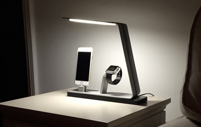
Pictured above, the MiTagg NuDock is a power station for your phone, watch, an included portable battery, and a third device via a hidden high-power USB port. It’s made from brushed aluminum and will come in the same silver or space gray colors as Apple’s phones and laptops. There’s also an LED lamp with touch-sensitive dimmer controls, which is exactly why I’m getting this for my bedroom.

Unfortunately, it’s not an MFi-certified device, so the Lightning connector isn’t built in. When you first get the station, you have to slide a Lightning cable through the dock to get the charger setup. Same thing for the Watch’s charger cable. But once you’ve done that, you can just drop your devices on the stand when it’s time to charge for the day — the dock supports any iPhone case and the Apple Watch’s inductive charging means you won’t need to fiddle with lining up the cable with a tiny micro-USB port as with some Android Wear watches.

In addition to the power station itself, the NuDock comes with the NuKi, a 2,000 mAh portable battery you can carry with you to keep your phone topped off over the course of a long weekend or a day of intense usage. On top of the sheer utility of a keychain battery, it also has some nifty smart features — you can use it to find the keys it’s attached to from an app on your phone, and use a button on the side to control the shutter in your camera app from a distance.

The NuDock is set to ship in July, so you’ll have to go a few months without one after receiving your Apple Watch. The early bird special is going for $129 on Indiegogo, but that will soon go up to $149. If you’re planning to skip the campaign to see feedback on shipping units before buying, MiTagg says the final retail price will be $249.

Featured Image: Mitagg
post from sitemap

Apple Watch Will Be Sold Online Only During “Initial Launch Period”

Apple Watch buyers will have to queue virtually in order to buy the device, at least initially. A press release this morning from the company reveals that the first batch of Apple Watch orders will only be collected via the Apple Store application for iOS devices and the online Apple store site.

Apple head of retail Angela Ahrendts confirmed this plan in the press release announcing pre-sales of the Apple Watch, which begin April 10 along with in-store try-ons and demos ahead of the April 24 official store date. In a statement included in the release, Ahrendts expressed it thusly:

To provide the best experience and selection to as many customers as we can, we will be taking orders for Apple Watch exclusively online during the initial launch period.

Typically, Apple uses its online retail outlets to collect pre-orders for devices ahead of their official launch date, but then allows customers to purchase them at its physical locations, without requiring any reservation ahead of time. This is what leads to the long lines that form regularly on iPhone launch day. A leaked memo from earlier this week suggested Ahrendts wanted to change Apple’s retail line practice, encouraging Watch shoppers specifically to head online to ensure they get what they want in a timely manner.

We contacted Apple to find out how far past the 24th that online orders only restriction might apply, but the company said it had nothing more to share beyond what was conveyed in the text of the release. Likely, when walk-in sales kick-off depends a lot on initial appetite and the overall success of this novel strategy.

post from sitemap

Kobo Glo HD E-Reader Offers Resolution On Par With Kindle Voyage For $70 Less

Kobo’s new Glo HD e-reader will boast the claim of highest resolution for the lowest price when it hits the market on May 1 for $129.99. The newest piece of hardware from Rakuten-owned Kobo offers 300 ppi pixel density on a 6-inch display, which matches the screen on the $199.99 Kindle Voyage in terms of resolution, and which should mean extremely crisp, pixel-free rendering of text.

In fact, both the Kobo Glo HD and the Kindle Voyage use e-ink’s Carta screen tech, which means text rendering similar to what you’d get with a super high resolution e-ink screen like those found in iPhones and modern Android devices, albeit using the low-power e-paper tech that displays in black and white and is better suited to a dedicated text reading device.

The Glo HD also features Kobo’s ComfortLight tech, which provides built-in lighting for reading in the dark. Other tech specs include a 1GHz processor (again, like the Voyage) and it has 4GB of on-board storage for your library (again, like the Voyage), which is plenty for most. It weighs just 180 grams (again, like the Voyage) and measures 157 x 115 x 9.2 mm (slightly shorter, but slightly thicker than the Voyage).

The main things the Voyage has that the Glo HD doesn’t is automatic lighting adjustment based on ambient lighting conditions, and page turn pressure buttons on the bezel. Kobo’s options also only has Wi-Fi connectivity, without a cellular option. All are nice-to-have features, but the resolution is honestly the Voyage’s greatest strength, so the Kobo offering the same screen type with a significant price savings could help it find a faithful audience – provided customers are willing to go with Kobo’s content ecosystem over Amazon’s.

post from sitemap